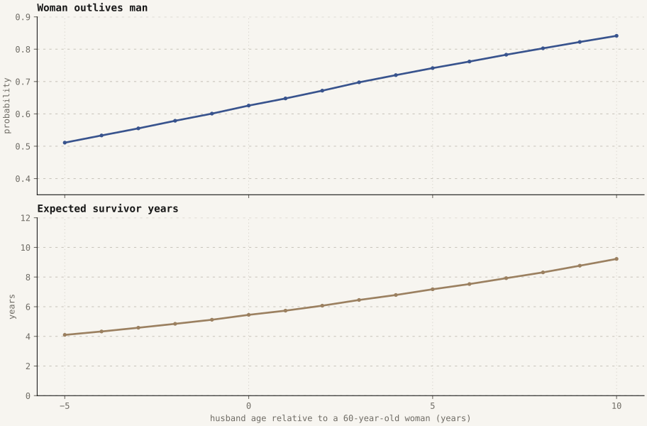
Widowhood simulation
This notebook generates the article's illustrative Monte Carlo experiment. It is a pedagogical model, not an estimate fitted to a country's mortality table. The partners are simulated independently, with Weibull remaining-lifetime distributions, so shared behaviours, assortative health, and bereavement effects are intentionally excluded.
The fixed seed, sample size, parameters, CSV output, and Matplotlib figure make the result reproducible.
The notebook also reports the symmetric survivor interval D = |T_f - T_m| and the probabilities that D is under one month (1/12 year) or one year.
import csv
from bisect import bisect_left
import math
from pathlib import Path

SEED = 20260822
SIMULATIONS = 200_000
WEIBULL_SHAPE = 4
WOMAN_MEAN_REMAINING_YEARS = 25
MAN_MEAN_AT_SAME_AGE = 22
MALE_YEARS_LOST_PER_POSITIVE_AGE_GAP = 0.55
AGE_GAPS = [round(-5 + step / 12, 6) for step in range(181)]
THRESHOLD_MONTHS = range(1, 61)

def create_rng(initial_seed):
    state = initial_seed & 0xFFFFFFFF

    def rng():
        nonlocal state
        state = (1664525 * state + 1013904223) & 0xFFFFFFFF
        return (state + 1) / 4294967297

    return rng

WEIBULL_MEAN_FACTOR = math.gamma(1 + 1 / WEIBULL_SHAPE)

def draw_weibull(mean, rng):
    scale = mean / WEIBULL_MEAN_FACTOR
    return scale * (-math.log(rng())) ** (1 / WEIBULL_SHAPE)

def rounded(value, digits=4):
    return round(value, digits)

def simulate_age_gap(age_gap, rng):
    male_mean = MAN_MEAN_AT_SAME_AGE - MALE_YEARS_LOST_PER_POSITIVE_AGE_GAP * age_gap
    woman_outlives = 0
    survivor_years = 0
    conditional_survivor_years = 0
    conditional_count = 0
    survivor_durations = []

    for _ in range(SIMULATIONS):
        woman_lifetime = draw_weibull(WOMAN_MEAN_REMAINING_YEARS, rng)
        man_lifetime = draw_weibull(male_mean, rng)
        difference = woman_lifetime - man_lifetime
        survivor_duration = abs(difference)
        survivor_durations.append(survivor_duration)
        if difference > 0:
            woman_outlives += 1
            conditional_survivor_years += difference
            conditional_count += 1
        survivor_years += max(difference, 0)

    result = {
        'age_gap': age_gap,
        'male_mean_years': rounded(male_mean, 3),
        'p_woman_outlives': rounded(woman_outlives / SIMULATIONS),
        'e_survivor_years': rounded(survivor_years / SIMULATIONS),
        'e_survivor_years_if_woman_outlives': rounded(conditional_survivor_years / conditional_count),
        'n_simulations': SIMULATIONS,
    }
    sorted_durations = sorted(survivor_durations)
    for months in THRESHOLD_MONTHS:
        result[f'p_survivor_lt_{months}m'] = rounded(
            bisect_left(sorted_durations, months / 12) / SIMULATIONS
        )
    return result

results = [simulate_age_gap(age_gap, create_rng(SEED + index)) for index, age_gap in enumerate(AGE_GAPS)]
results[60], results[-1]
import matplotlib
matplotlib.use("Agg")
import matplotlib.pyplot as plt

output_directory = Path("public")
(output_directory / "analysis").mkdir(parents=True, exist_ok=True)
(output_directory / "figures").mkdir(parents=True, exist_ok=True)

gaps = [row["age_gap"] for row in results]
probabilities = [row["p_woman_outlives"] for row in results]
survivor_years = [row["e_survivor_years"] for row in results]
short_month = [row["p_survivor_lt_1m"] for row in results]
short_year = [row["p_survivor_lt_12m"] for row in results]

plt.rcParams.update({"font.family": "DejaVu Sans Mono", "font.size": 9})
fig, axes = plt.subplots(3, 1, figsize=(9.5, 8.5), sharex=True, constrained_layout=True)
fig.patch.set_facecolor("#f7f5f0")

axes[0].plot(gaps, probabilities, color="#38538d", marker="o", markersize=3, linewidth=2)
axes[0].set_title("Woman outlives man", loc="left", color="#171717", fontweight="bold")
axes[0].set_ylabel("probability", color="#6d6a63")
axes[0].set_ylim(0.35, 0.9)
axes[0].grid(axis="y", color="#c9c5bc", linestyle=(0, (3, 5)), linewidth=0.8)

axes[1].plot(gaps, survivor_years, color="#9b8060", marker="o", markersize=3, linewidth=2)
axes[1].set_title("Expected survivor years", loc="left", color="#171717", fontweight="bold")
axes[1].set_ylabel("years", color="#6d6a63")
axes[1].set_xlabel("husband age relative to a 60-year-old woman (years)", color="#6d6a63")
axes[1].set_ylim(0, 12)
axes[1].grid(axis="y", color="#c9c5bc", linestyle=(0, (3, 5)), linewidth=0.8)
axes[2].plot(gaps, short_month, color="#38538d", marker="o", markersize=3, linewidth=2, label="under 1 month")
axes[2].plot(gaps, short_year, color="#9b8060", marker="o", markersize=3, linewidth=2, label="under 1 year")
axes[2].set_title("Short survivor duration", loc="left", color="#171717", fontweight="bold")
axes[2].set_ylabel("probability", color="#6d6a63")
axes[2].set_xlabel("husband age relative to a 60-year-old woman (years)", color="#6d6a63")
axes[2].set_ylim(0, 0.1)
axes[2].legend(loc="upper right", frameon=False)
axes[2].set_xticks([-5, 0, 5, 10])

for axis in axes:
    axis.set_facecolor("#f7f5f0")
    axis.spines["top"].set_visible(False)
    axis.spines["right"].set_visible(False)
    axis.spines["left"].set_color("#171717")
    axis.spines["bottom"].set_color("#171717")
    axis.tick_params(colors="#6d6a63")
    axis.grid(axis="x", color="#c9c5bc", linestyle=(0, (1, 4)), linewidth=0.7)

fig.savefig(output_directory / "figures" / "widowhood-simulation.svg", format="svg", metadata={"Date": None})
svg_path = output_directory / "figures" / "widowhood-simulation.svg"
svg_path.write_text("\n".join(line.rstrip() for line in svg_path.read_text().splitlines()) + "\n")
fig.savefig(output_directory / "figures" / "widowhood-simulation.png", format="png", dpi=180, facecolor=fig.get_facecolor())
plt.close(fig)

with (output_directory / "analysis" / "widowhood-simulation.csv").open("w", newline="") as handle:
    writer = csv.DictWriter(handle, fieldnames=results[0].keys())
    writer.writeheader()
    writer.writerows(results)

print(f"Generated {len(results)} age-gap scenarios with {SIMULATIONS} simulations each.")
print(f"Baseline age gap 0: P(woman outlives)={results[60]["p_woman_outlives"]}, E[survivor years]={results[60]["e_survivor_years"]}")
print(f"Age gap +10: P(woman outlives)={results[-1]["p_woman_outlives"]}, E[survivor years]={results[-1]["e_survivor_years"]}")
print(f"Baseline age gap 0: P(survivor years < 1 month)={results[60]["p_survivor_lt_1m"]}, P(survivor years < 1 year)={results[60]["p_survivor_lt_12m"]}")
print(f"Age gap +10: P(survivor years < 1 month)={results[-1]["p_survivor_lt_1m"]}, P(survivor years < 1 year)={results[-1]["p_survivor_lt_12m"]}")
Generated output
These selected rows come from the committed CSV output. They are model-generated results, not observed demographic estimates.
| Husband's age gap | P(woman outlives) | Expected survivor years | P(survivor interval < 1 month) | P(survivor interval < 1 year) | Simulations |
|---|---|---|---|---|---|
| 0.0 | 0.6253 | 5.4492 | 0.0066 | 0.0794 | 200000 |
| 10.0 | 0.8402 | 9.2185 | 0.0047 | 0.0571 | 200000 |